Apple Watch series 5
I’ve been a wearing the new Apple Watch series 5 for just over a month, and I have some thoughts about how it compares to the previous generation.
The biggest change is, of course, the always-on watch face. This has fundamentally changed the way I use the watch. Any Apple Watch wearer will tell you that you needed to perfect the gesture of rotating your wrist just enough to activate the watch until now in order to see the time. With the series 5 a cursory glance from any angle is all that is required. It’s surprising how long it takes to de-programme this action from your brain for simple time reads. Even harder, you now need to differentiate between a glance to simply tell the time and wanting to react to a notification. You have to think in advance what you want from your watch when you look at it and change your physical reaction to get the desired result. Not a big problem by any means, but a surprisingly difficult change in learned behaviour.
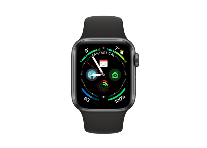
This ability to see the time has also changed my relationship with faces. With my Series 4 I loved the Infograph face with the maximum number of complications displayed. I set up this face when I got that watch and after some early experimentation with the new complications, it basically remained the same for the whole year.
Time was mostly secondary and the volume of other stuff going on made it all the more difficult to tell the time quickly. But it felt more like what a smart watch should do to me. Turns out it’s what I expected of a watch you needed to actively gesture to wake. Being able to always see the face made the legibility of time more important. The noise of complications, several of which are blank until woken for privacy reasons, made cursory time glances harder. This led me to experiment with faces again, and with Watch OS 6 came new faces.
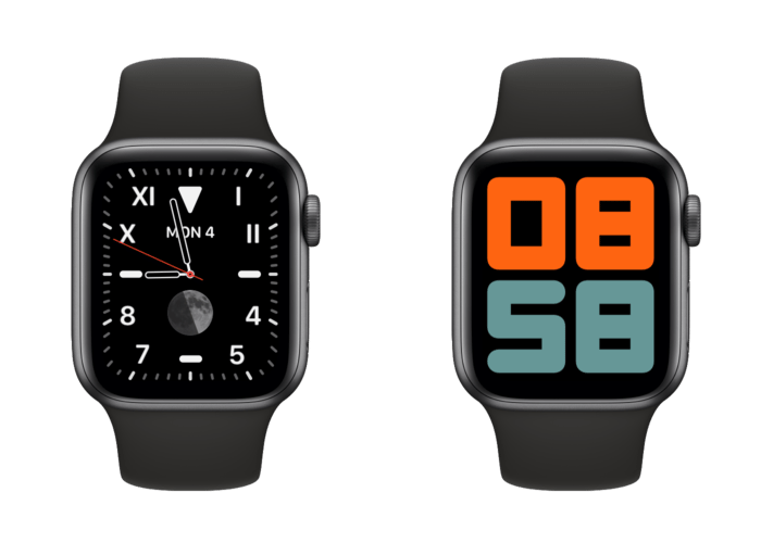
For now I’ve settled on the San Francisco face in blue with the date and a carrot weather complication. I have the mixed numerals face in blue.
When asleep the face changes to monochrome and colours-in on wake. I like the blue colour but also the fact the indices and hands remain the same colour. I love the white San Francisco face, but the entire thing inverts from a black face with white hands and indices, to the reverse on wake. This inversion is jarring and creates an optical illusion where the face elements appear to change in size during the transition.
How a face transitions from always on to awake now plays a large post in my Apple Watch face selection.
I’m flirting with other faces, including a black San Francisco face with the excellent Geneva Moon complication, and the new numerals duo face.
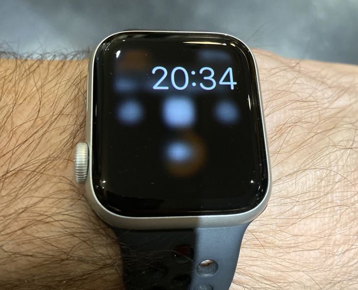
One thing I don’t like is how the face reacts when there’s anything other than a watch face on screen. If you have a notification or app open and the screen sleeps, the view is blurred and a digital time overlaid.
I have my watch set to show the last app within 2 minutes of last use, after which the watch face returns. But I also have auto-launch audio apps turned on. When I’m out I’m often listening to podcasts with Overcast, whose app will display as a remote while playing, so the majority of the time I’m looking at my watch while out it looks like the above.
I understand why, but I wish there was a setting to turn this off. For it to work well we’d need third party app always-on support where a monochrome, 1 hertz refresh rate mode could be set by each developer. I’d settle for a grayscale screenshot of the last screen state for now. I’ve not set up my Apple Watch to have much private data visible. Messages are perhaps the only sensitive data that could ever display for me, and maybe these types of screen content are an exception and always blur out. Just let me choose, or even better give me app-by-app controls to set my screen privacy settings.
I’ve not used the compass yet, but I navigate with my watch a few times a year. I imagine the experience will be slightly better when I do. But meh.
I’ve been lucky enough not to have any battery issues as others have been reporting. I end a day with an hour of working out with around 50% by the time I switch to my night watch for sleeping.
Overall in very happy with the always-on screen. It has changed how I use my watch for the better. Unless you really want it, there’s not much reason to upgrade if you have a series 4 already, but any older and it would make sense.


